Colour Psychology to evoke emotions
- Shelley Tilbrook

- Nov 2, 2020
- 5 min read
When developing a brand, designing collateral or a building a website we refer to colour psychology when selecting a suitable colour palette.

This helps us make informed decisions that suit the brand personality, values and emotions we want to evoke from the customer.
Psychological studies have found that our perception of colours differs extensively. Each colour gives off a different, unique message to us.


Colour is an essential tool because it has an impact on how we think and behave. Colour directs our eye where to look, what to do, and how to interpret something. It puts content into context. It helps us decide what's important and what's not.
The psychology of colour is based on the mental and emotional effects colours have on sighted people in all facets of life. There are some very subjective pieces to colour psychology as well as some more accepted and proven elements. Keep in mind, that there will also be variations in interpretation, meaning, and perception between different cultures.
The benefits of applying colour psychology to your design and branding decisions include:
The ability to evoke emotions from the end user.
The ability to align the brand with the brand values and your customer.
The ability to direct attention.
The ability to influence behaviour.
So what do your brand colours mean?

Here’s an outline of each colour both for the mood it portrays and the meaning or behaviours it drives. This article has been compiled from a variety of sources on colour psychology to give you a complete picture.
Yellow
Mood: Happiness, Confidence, Playful, Fun, Joy, Cheerful
Meaning: optimism, Innovation, Intelligence, Friendly, Positivity


Yellow is the most noticeable of all colours to the human eye.
The radiance of yellow promotes happiness and optimism in the observer. Yellow is said to promote happiness more than any of the other major colours. Believed to have an influence on the left side of the human brain, yellow helps foster strong analytical thinking.
While it can be attention grabbing, it can also lead to agitation in the observer. Though it appears warm and bright, yellow can lead to visual fatigue so must not be overused. It is best as a highlight or accent colour. Less is more for yellow!
Some positive effects of yellow include:
Increased mental activity
Heightened awareness
Increased energy levels
Given it’s eye popping nature, yellow works well in advertisements. It is important to keep in mind that yellow should be used in moderation.

Orange
Mood: Energy, Motivation, Enthusiasm, Fun
Meaning: Optimism, Positive, Youthful, Endurance, Success, Clarity, Assurance


Orange has a very interesting psychological meaning as it combines red's power and energy with yellow's friendliness and fun. The mix makes orange a good representation of physical comfort in our warmth, food, and shelter.
Orange is also known to be a colour of motivation, lends a positive attitude, and general enthusiasm for life. Overall, orange is great for bringing comfort in tough times, and creating a sense of fun or freedom in your visuals.


Pink
Mood: Soothing, Feminine, Affection, Romantic
Meaning: Compassion, Caring, Empathy, Nurturing, Love, Sensitive, Youthful, Hope


Pink is a softer, less intense version of red that creates a sense of compassion and unconditional love. While it's a very physical colour, it soothes rather than stimulates, making it a perfect colour for caring, understanding, and nurturing those in need. It reduces erratic behaviour.
Pink is a sign of hope. It is also known to be very romantic as it shows empathy and sensitivity. If too much pink is used, it can be very draining, show a lack of power, and even immature. Overall, pink can be a great counter-option to the colour red when used appropriately.
Red
Mood: Excitement, Love, Passion, Dramatic, Alert
Meaning: Powerful, Strength, Aggression, Ambition, Urgent


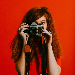


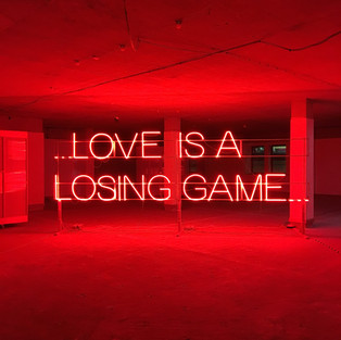


Red is a very powerful, dynamic colour that reflects our physical needs whether to show affection and love, or to portray terror, fear, and survival. Red is also a very energising colour that can portray friendliness and strength, but can also be demanding and show aggression depending on its context.
Overall, if you're looking to have a really powerful presence or get someone's attention fast, red is your go-to colour. Just remember to use it sparingly to avoid the extreme negative reactions it can so easily awaken.
Red is commonly used for advertising sales as it implies urgency.

Green
Mood: Calm, Envious, Adventure
Meaning: Growth, Health, Harmony, Progress, Nature, Safe, Logic


Green is a colour of balance and harmony. It lends us a clearer sense of right from wrong since green incorporates a balance of both the logical and emotional. Green is one of the most-seen colours in nature reflecting life, rest, and peace. It is also a sign of growth, whether that's in a physical object like plants or in our income and wealth.
Overall, if you're looking to portray health, rest, and to relieve stress, green is your colour. While green does have minor negative aspects like over-possession and materialism, it has a more positive affect than most other colours.
Blue
Mood: Calm, Sadness, Destress, Serene, Focussed
Meaning: Reliable, Trustworthy, Power, Authority, Technology, Strength, Integrity, Intelligence, Competence


Blue is known for its trust and dependability. It's reliable, responsible, and mentally soothing. For that reason alone, it's one of the most-liked colours across the entire world.
Unlike red, blue lends a more mental reaction rather than physical that allows us to destress, calm down, and think of the most ideal situation. Unfortunately, it also is one of the last colours to be seen, and can be perceived as distant, cold, or unfriendly if used it great amounts.
Overall, blue is a well-liked colour that can bring a sense of calmness and trust when building relationships, especially in marketing.
Blue if highly used in the medical industry, technology industry and law enforcement.

Purple
Mood: Spiritual, Creative, Calm,
Meaning: Loyalty, Courage, Luxury, Value, Wisdom, Magic, Mystery


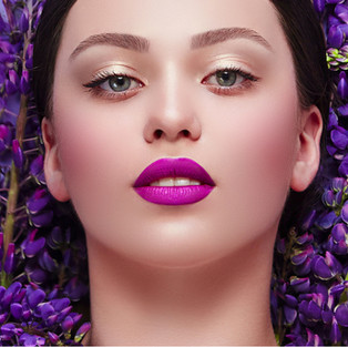


Purple is most commonly known for its imagination and spirituality. It possesses the energy and power of red, with the stability and reliability of blue, making it a perfect balance between the physical and spiritual. Purple is often used to show luxury, loyalty, courage, mystery, and magic.
It's a very intriguing colour as it soothes, but also presents space for mystery and new ideas. This is why creativity is most often associated with the colour purple. When using purple, avoid using it too often as it can also cause too much introspection or distraction as thoughts begin to wonder.

Black
Mood: Serious, Dramatic, Fear, Powerful, classy
Meaning: Power, Sophistication, Elegance, Formality, Mystery, Discipline


Black absorbs all light, so it’s a low-energy colour. Though black used in contrast–particularly with white or yellow–does create energy, black on its own can be depressing and can dampen the mood. Black lines on white paper are stark, definite marks–bearing huge communicative potential for transmitting information.
We think of black as sophisticated and serious. It’s the preferred colour for much formal attire, and the little black dress is a classic piece of attire that’s timeless and always appropriate. Black is unambiguous, definite. It’s not easily misunderstood, and in design it’s dramatic and helps create a feeling of certainty.
As a result, brand designers carefully select the brand colour palette to support the emotion the brand wants to evoke in its customer.
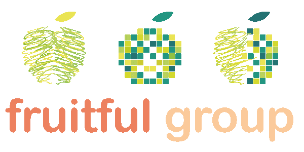
Here’s a sample of brand logos matched to theIr primary brand colour.


So are you happy with your brand colours or do you need a refresh?
Contact us for an obligation-free evaluation and strategy session.


Comments